QR Codes
Creating a QR Code With a Logo: Branding Without Losing Readability
The contrast, quiet zone and error correction rules you need to know to keep your QR code readable when you add your logo and corporate colors.
A plain black-and-white QR code does the job, but on a brochure, a package or a shop window it does not look like part of your brand. A code with your logo in the middle and your corporate colors looks more professional and reassures the person scanning it that "this code really belongs to this company". But design freedom has its limits: a logo QR code that breaks a few basic rules will not scan, no matter how good it looks. In this guide we explain those rules without drowning you in technical detail.
Why does adding a logo not break the code?
QR codes are designed so that they can still be read even if part of the information is lost. The feature that makes this possible is called error correction: the code carries extra "backup" data alongside the content. If part of the code gets dirty, torn or covered by a logo, the phone fills in the missing part from this backup data.
The QR standard has four error correction levels:
| Level | Approximate recoverable area | When is it a good fit? |
|---|---|---|
| L (Low) | ~7% | Clean environments, plain codes without a logo |
| M (Medium) | ~15% | General use |
| Q (Quartile) | ~25% | Print that may get slightly worn |
| H (High) | ~30% | Codes with a logo in the middle, outdoor use |
The logo covers some of the squares in the middle of the code; in other words, you are deliberately "damaging" it. That is why a high error correction level is preferred for codes with a logo. One important detail: the higher the level, the more squares the code contains and the denser it looks. That makes keeping the content short even more important.
Logo size: how big can it be?
The error correction margin should not be spent entirely on the logo; some must be left for printing flaws, reflections and camera blur. A common, safe approach is:
- The logo should cover only a small part of the code's total area; in practice, a size between one fifth and one quarter of the code's width works without problems in most cases.
- The logo should sit exactly in the center. It must never touch the three large squares in the corners (the position markers).
- Leaving a small white background or space around the logo stops the code's squares and the logo from blending into each other.
- Use a simple icon or monogram rather than a complex logo with thin lines. Logos with long text are unreadable at small sizes.
Contrast: the most overlooked rule
The phone camera reads the code by the difference between light and dark areas. Follow these rules when choosing colors:
- Dark foreground, light background. Navy on white, not white on navy. Some readers do not recognize inverted codes at all.
- High contrast. If your corporate color is a light shade (yellow, light orange, pastel), do not use it as the foreground color; use it in the frame or the label instead.
- Avoid gradients and patterned backgrounds. A photo or texture behind the code seriously reduces readability.
- It does not have to be black. Dark corporate colors such as dark blue, dark green or burgundy work very well on a white background.
| Combination | Result |
|---|---|
| Black / navy code, white background | Safe |
| Dark corporate color, white or cream background | Usually safe, always test |
| Mid-tone color, light gray background | Risky |
| Light code on a dark background (inverted) | Avoid |
| Photo or pattern over the code | Avoid |
Quiet zone: the space around the code
The empty area around a QR code is called the quiet zone. It is how the phone works out where the code starts and ends. The standard calls for a margin at least four squares wide on all four sides of the code.
The most common mistake designers make is pushing the code right up to the edge to save space, or placing text and lines immediately next to it. Treat the quiet zone as an integral part of the design; if you put the code inside a frame, leave space between the frame and the code as well.
Frame and call to action
A short line next to a logo QR code, such as "Scan to see the catalog", is one of the easiest ways to increase the scan rate. A labeled frame above or below the code both attracts attention and tells people what will happen when they scan. You can freely use your corporate color for the frame; just keep the code itself high-contrast.
Preparing a QR code with a logo step by step
- Define the content and use a dynamic code if possible. A short link keeps the code simple and leaves more room for the logo.
- Prepare a simple version of the logo. An icon without text, a monogram or a square logo gives the best results. Prepare the file as a high-resolution PNG.
- Choose the colors. Pick a dark corporate color for the code's foreground and white or a very light shade for the background.
- Place the logo in the center and leave a small white area around it.
- Add a frame and a label. This is where you can use your corporate color more freely.
- Test it. Scan it with different phones, at actual size and from the actual distance. If scanning is slow, first make the logo smaller, then increase the contrast.
- Create a design standard. Using the same color, logo size and label wording across the company makes your codes recognizable everywhere.
Common mistakes
- Making the logo so big that it covers half the code
- Moving the logo over the position markers in the corners
- Placing a PNG logo with a transparent background directly on the squares (leaving no background behind the logo)
- Using a light corporate color as the code's foreground color
- Over-decorating the code with rounded or stylized squares, skewed angles and effects
- Testing on screen but not testing the print
Testing before printing
Test the logo QR code with different phones, at the intended actual size and distance. A code that scans perfectly on screen can cause problems on glossy paper or a small label. We explain the relationship between size and distance in detail in our QR code print size guide.
QR codes with a logo in EcoQrCard
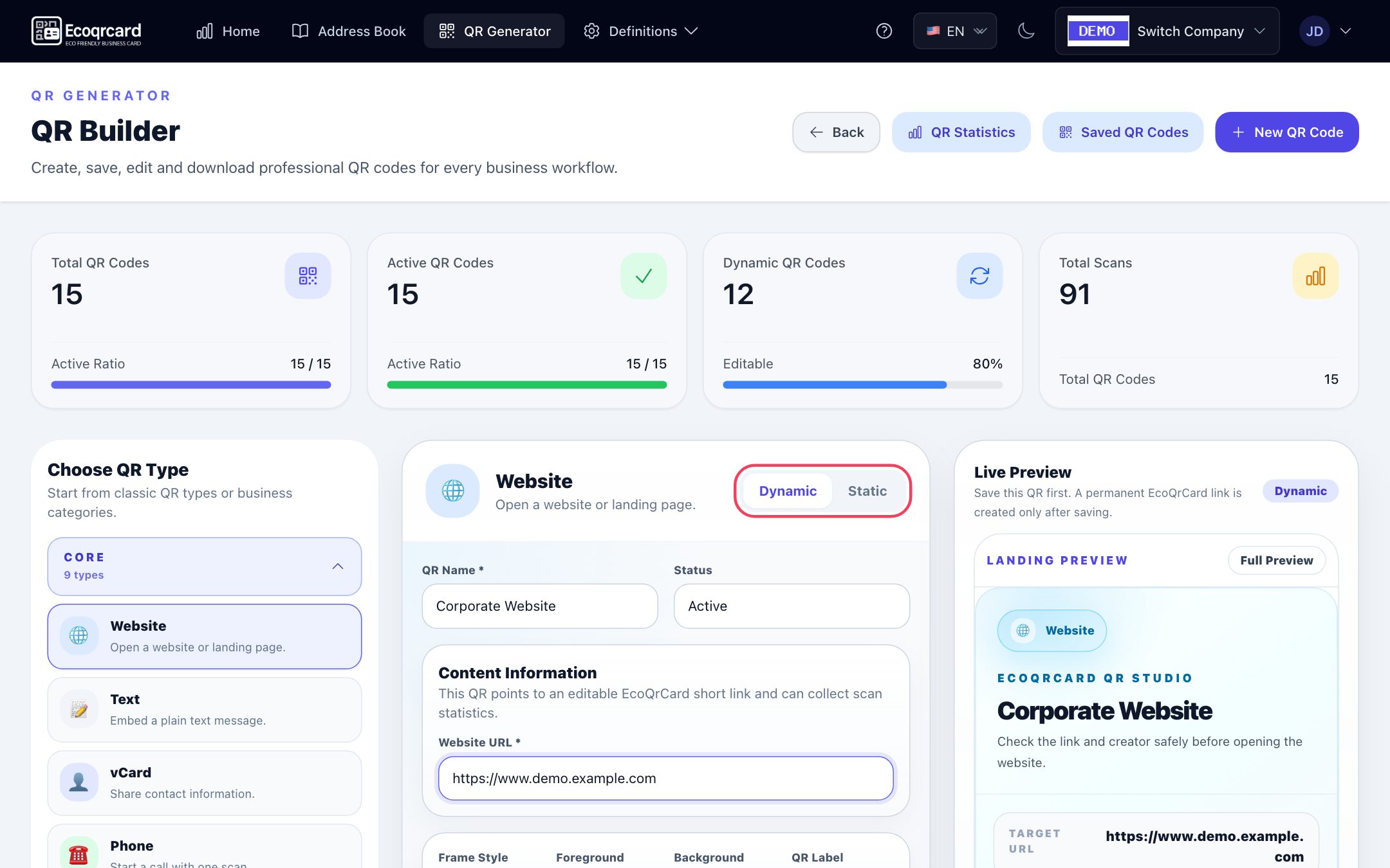
The EcoQrCard QR Generator applies most of the rules in this guide by default, so you do not have to think through every design decision yourself:
- Error correction level H. Codes in the QR Generator are created with the highest level (H, about 30%), leaving room for the logo in the middle.
- Fixed logo size and background. The image you upload in the QR Center Logo field (up to 5 MB) is shown exactly in the center of the code, inside a small box with a white background. The logo takes up about one sixth of the code's width and does not touch the position markers in the corners. Even if you use a transparent PNG, there is a white background behind it.
- The colors are up to you. You choose the Foreground and Background colors to match your corporate colors; keeping the contrast high is your responsibility (dark foreground, light background).
- Frame and label. For Frame Style you can choose None, Soft Frame or Label Frame, and in the QR Label field you can write the short call to action that appears below the code (the default is SCAN ME).
- Landing page image. For dynamic codes, the Landing Cover Image (up to 10 MB) becomes the header image of the page that opens when the code is scanned.
The Live Preview on the right shows every change instantly, so you can try out colors on screen before printing.
Which button gives you which image? This distinction matters:
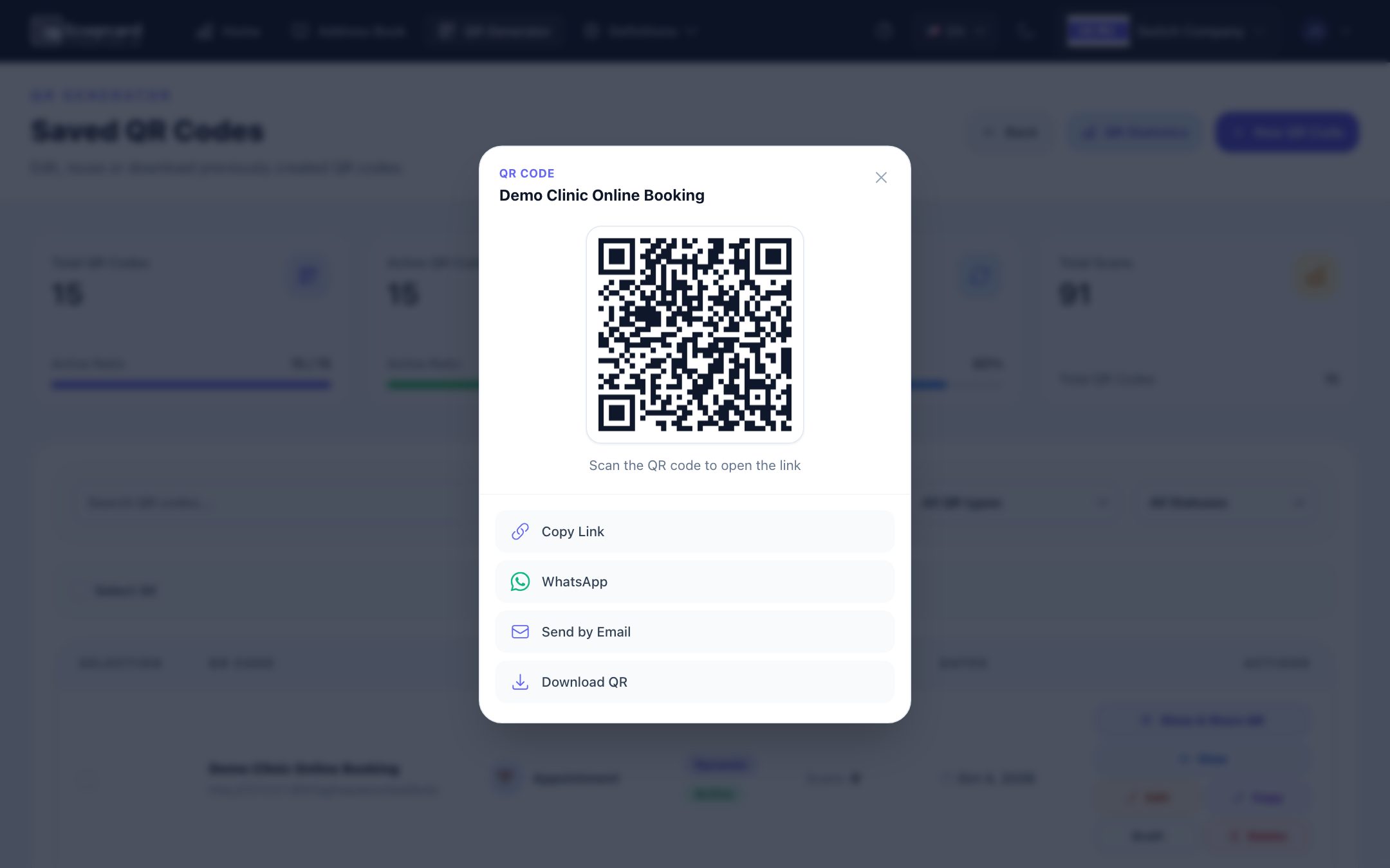
| Where do you download it? | What do you get? |
|---|---|
| PNG below the live preview on the create/edit form | The design with logo, colors, frame and label. Use this for print. |
| Show & Share QR → Download QR in the saved codes list | A plain, dark QR image on a white background, without a logo. For quick sharing. |
To get the branded image of a saved code again, simply open the code in the form with Edit and click PNG. For a dynamic code, the PNG button becomes active after saving, because that is when the permanent link is created.
We recommend creating logo codes as dynamic codes: the same code keeps working even if the link or file changes after the code is printed, and the short link makes the code less dense. We explain the difference in our guide to static vs. dynamic QR codes.
Your employees' personal QR business cards are managed in a separate module: the card page opens with your company logo and details, while the QR code itself is a plain code without a logo. For details, see our digital business card page.
If you would like to manage on-brand, measurable QR codes with your logo for your whole company from one dashboard, request a quote.
Frequently Asked Questions
Is a QR code with a logo harder to scan than a normal one?
Not when it is prepared according to the rules. With a high error correction level, a reasonable logo size, high contrast and a preserved quiet zone, logo codes scan as easily as plain ones.
Can I make my QR code my corporate color?
Yes, as long as the color is dark enough and used on a light background. Use light shades in surrounding elements such as the frame or label, not in the code itself.
What is the error correction level, and why does it matter?
It is backup data that lets the phone fill in a damaged or covered part of the code. Using a high level in codes with a logo in the middle compensates for the squares the logo covers.
Should the logo have a transparent background?
The logo file can be transparent, but when it is placed on the code there should be a white or light background behind it. Otherwise the logo and the code's squares blend into each other.
Is it enough to test the logo code on screen?
No. You should try the code at the intended size, on the material it will be printed on and from the real scanning distance, with different phones. Print quality and surface reflections can cause problems that do not show up on screen.